Working hard! Design, design and design
- samuraigamesuk

- Jun 16, 2020
- 3 min read

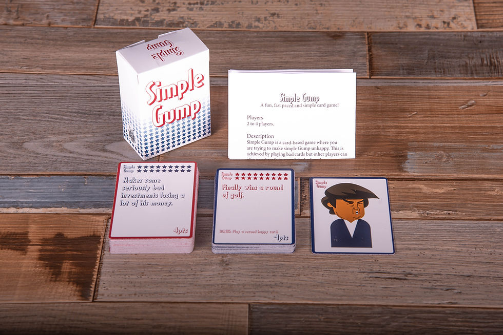
When we set out to create Simple Gump we had a basic idea of how we wanted the game to look. We opened up illustrator and got to work and after a few hours we had every card created.
This is when it hit us that we had designed something that looked like a piece of crap! There was nothing right about the design at all. It is hard to put in to words how bad the design was.
Back to illustrator and we spent several more days working on the cards and we have the second version. This version was something we liked and thought worked well with the idea for the game. We looked at our baby and was like "Yeah this is awesome!" then we showed some people and got the same feedback "it is hard to read the text".
Back to illustrator and we spent hours going through font formats to find one that worked and we found one we really liked. We spoke to the same people and they agreed you could read the test. Great! Making progress here! Sadly this did not last long. The test just did not work with the design we had it just felt out of place.
Now we were at a cross road, one way we would change the font the other way redesign the cards once again. We decided to keep the font and work on the cards some more! Back to illustrator and we went to work. Several days later and we had the third version or fourth depending on how you count the font swap and we showed people again. We got a lot of good response! Yes!!!!! We finally had a version that we could get printed and see how well it worked overall. We got a version printed for play testing and to see how it looked in person and we were happy. This was once again short lived, we played with several people and they found the game borders and text colours confusing. We thought it made sense but other people did not. We had to listen to the feedback, if people find it confusing then it is confusing.
Once again I found myself on illustrator working away on creating a new version of the game and that is where I am today. I have spent several days once again working on the card design and I have really changed the design. We now have a version we think looks good and makes more sense to the player. Not only that but the people who were confused by the design and colours now think it makes sense again.
We got there in the end! I can not count how many hours I have put into working on the design and the design is so very simple! However it just shows that even without a lot of artwork you will spend hours designing the game again and again.
What did I learn from this? Ask more people from the start what they think, work on that feedback straight away. Share the crap out of the designs again and get more feedback and tweak it till you have a version you are happy with and the majority of the people in the real world like. Remember you can not make everyone happy and if you tried you would go insane working on the design again and again. Just aim for a version most people like and that you yourself like.


Comments