Designing the card front
- samuraigamesuk

- Jun 17, 2020
- 2 min read

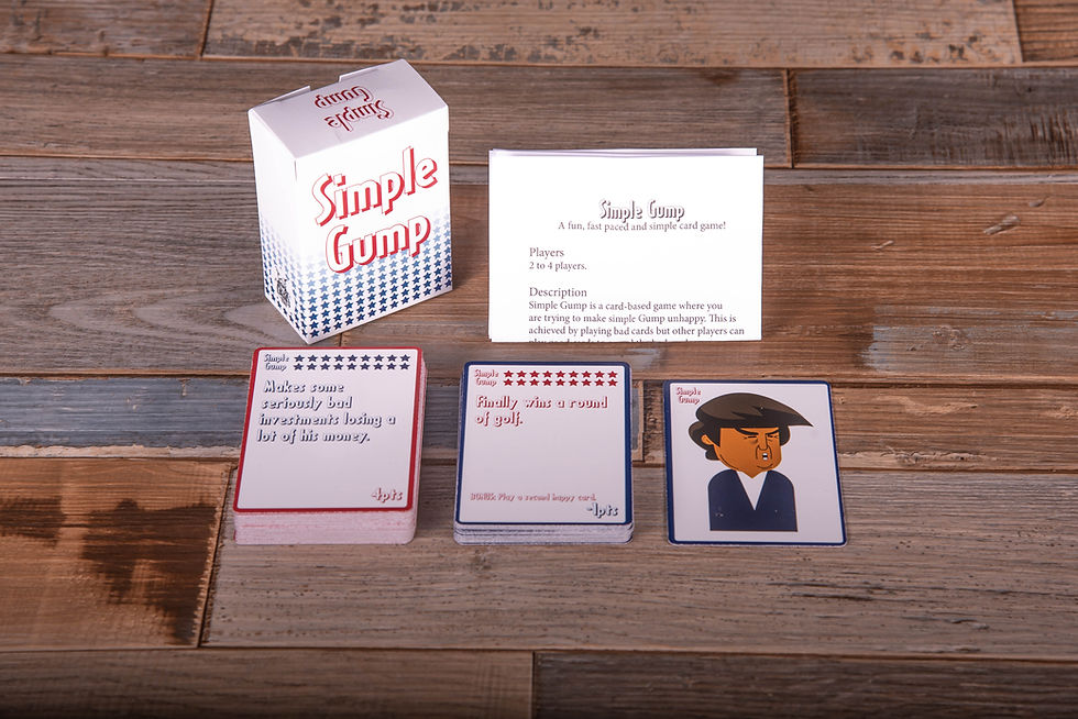
Look at them all! And that is not all of them, there were many that I did between these ones that I just did not save or deleted in the end! 13 designs that were edited again and again to create the card fronts we are using in the final prototype.
Now the first design on the image above was roughly the first one we created and we looked at it and thought it looked like a bag of crap. I mean look at it! What was we thinking? I would not buy a game if the cards looked that basic! We then started to edit the design and the colour scheme and before long we changed the font because we did not like the first font. The next font we picked we really liked but looking at it now I once again think what on this earth was we thinking? It is awful.
We edited the design with that font for a little bit and played around by adding the logo and the stars at the top and we were still playing around with the colours. After the play test where people said the font was hard to read at times and it was we moved on to a new font. When we used the font knew we had found the one! Sounds cheesy but it was true, it just worked. Now we had the font we thought we had a great colour scheme and we got out first prototype printed.
We were in love with the design and people were enjoying the game but one note kept coming up people struggled to tell if it was a good or a bad card. We thought it was obvious but if that was the feedback we were getting we knew we had to make changes again.
Back we went again and worked on the design until we had created the final design.


We made the border black so when the cards are in the deck you could not tell which card was coming next. We then changed all the text to be the same colour on the card instead of mixing it up. Finally we made sure the bad cards were red and the good cards were green.
The people we showed the designs to were happy and said it made it easier to tell what was a good card and what was a bad card. We had done it! We had made everyone happy and we actually really liked the final design. It just goes to show that you need to keep getting feedback and working on your designs. You can not make everyone happy but try to make the majority happy including yourselves. You need to have a design that you like and would be willing to spend money on. If you look at our final cards compared to the first one we designed you can see the difference and we have a product now that looks professional and feels it. If I saw that design else where I would buy it, I would not believe someone with very little design knowledge had produced that. Well I shall leave that here! Thank you for reading.


Comments